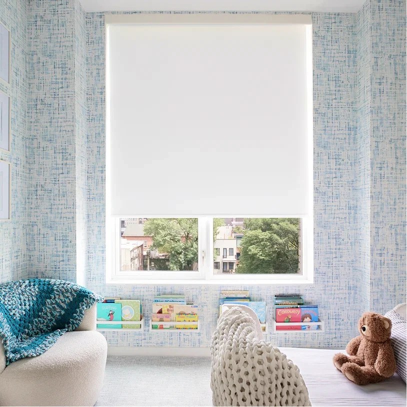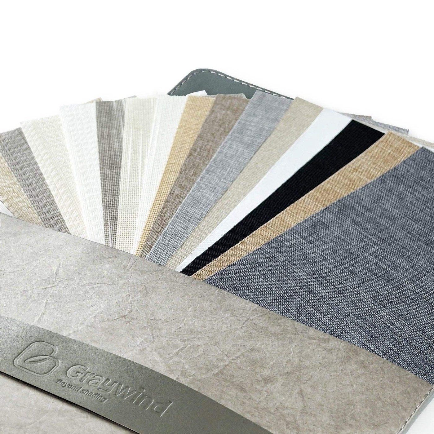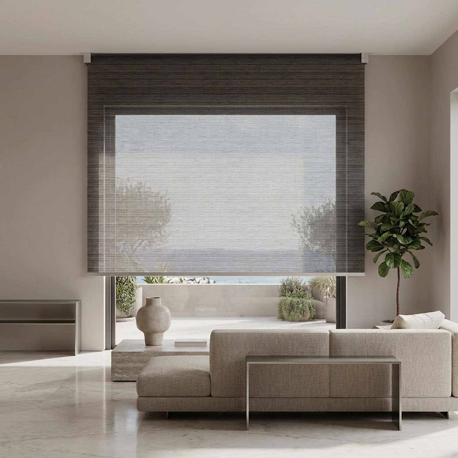
The right roller shade color can make a room feel finished; the wrong one can look yellow, blue, too dark, or disconnected from the trim. Roller shade samples match wall color most accurately when you view them in the actual room, beside the permanent finishes, at several times of day. A screen image cannot show how fabric, paint, flooring, and sunlight interact.
World Wide Shades makes sample-led selection easier. Order World Wide Shades swatches before choosing a full-room fabric, then use the builder to compare openness, control, and mount options. If two samples appear nearly identical online, contact World Wide Shades or call (844) 674-2716 for help narrowing the choice by room, orientation, and desired light level.
Why online color matching is unreliable
A monitor emits light; a shade sample reflects light. Device brightness, color settings, photography, and the surrounding webpage can shift a fabric's appearance. A warm beige may look gray on a cool screen. A charcoal solar screen may appear black in a thumbnail but read as a soft graphite when daylight passes through it.
Paint also changes with light. A north-facing room often reads cooler than a south-facing room; east-facing light is strongest in the morning, while west-facing light becomes warmer late in the day. LED bulbs can range from about 2,700K warm white to 4,000K or higher cool white, changing how the same fabric looks at night.
A sample is not just a color chip. It reveals the weave, sheen, openness, reverse side, and scale of the texture. The window shades color guide offers broader palette ideas, but the final decision should be made with the physical fabric against your own finishes.
Gather the right samples first
Order samples that cover a controlled range rather than ten nearly identical beiges. A useful starting set includes:
- One shade close to the wall color.
- One shade close to the trim or ceiling.
- One shade 1–2 steps lighter.
- One shade 1–2 steps darker.
- One neutral with the opposite undertone.
- One texture with a different weave or sheen.
For solar fabrics, compare at least two openness levels, such as 1% and 3% or 3% and 5%. A 1% screen generally offers more glare control than a 5% screen, while a 5% screen usually preserves more view and daylight. For privacy, include a light-filtering or room-darkening sample; a solar screen that looks perfect in the daytime may show silhouettes at night.
Request a World Wide Shades swatch set and label each piece as it arrives. Keep the order card or fabric code with the sample so a later room can be matched accurately.
A five-step sample comparison method
Hold the fabric vertically beside the wall, not flat on a table. Place it next to the window casing, baseboard, flooring, countertop, upholstery, and any large artwork. The wall may be repainted; trim and floor are often more permanent, so they deserve extra weight.
Look for undertones: yellow, red, green, blue, or gray. Two samples can both be called “white” while one reads warm and the other reads cool. A cool white next to creamy trim can make the trim look yellow; a warm beige beside gray flooring can look muddy.
Tape the sample at the window with the fabric facing the same way the finished shade will face. Check it at least three times. Direct sun can make a warm fabric glow; indirect light can flatten texture; interior LEDs can expose an undertone that daylight hides.
For a south- or west-facing window, compare the sample with the shade closed and partly open. The best shades for south-facing windows guide explains why exposure changes a fabric decision. Contact World Wide Shades if you are choosing between glare control and a brighter view.
Solar screen fabrics can look different from the room side and street side. Stand six feet back, then two feet back. Note whether the texture disappears at a distance or becomes a pattern. In a small room, a high-contrast weave can feel busier than it did in a sample photograph.
At night, turn on the room lights and look from outside if privacy matters. A light-filtering cloth may still reveal silhouettes. For a bedroom or media room, compare the light-filtering shades guide with blackout curtains vs. blackout shades.
Flooring covers a large visual area and is often warmer or cooler than paint. Put the sample on a clean piece of white paper, then hold it near the floor. A beige shade may bridge warm oak and neutral paint; a gray shade may connect cool tile to blue-gray walls.
Do not place the sample on a glossy surface and judge only the reflected color. Move it into the plane of the future shade. Ask World Wide Shades for a coordinated palette review if the room includes multiple woods, stone, or patterned fabrics.
A 2-by-3-inch sample does not show a 72-inch-wide shade. Lay several identical sample pieces edge to edge if you have them, or use the product's larger swatch when available. Texture and repeat can look more prominent over a broad opening.
A darker fabric can visually shrink a window; a close-to-wall fabric can make the opening feel quieter and larger. If a valance or cassette will be visible, compare that finish too. Review roller shade valance options before approving the whole assembly.
Match the shade to paint: three reliable strategies
Choose a shade within the same color family as the wall, usually within one or two perceptual steps. This creates a calm, architectural look and works well when the window shape should recede. The shade does not need to be an exact paint match; a slightly different texture helps prevent a flat, painted-on effect.
Match the shade to white, cream, black, or stained trim when you want the window treatment to look built in. This approach can organize a room with several wall colors. Check warm and cool whites carefully because a 50-inch shade can make an undertone more obvious than a small paint chip.
Choose a shade that repeats a stable accent, such as a dark window frame, wood floor, sofa, or metal fixture. Contrast works best when the same color appears at least twice elsewhere in the room. The window shade trends for 2026 guide can provide inspiration, but use samples to prevent a trend color from fighting existing finishes.
World Wide Shades can build a coordinated set across rooms. Use the builder to compare one fabric for every window against a room-by-room plan, or contact the team when adjacent spaces need slightly different light control.
Openness changes perceived color and brightness
The more open a screen, the more the exterior view and daylight can influence the shade's perceived color. A 10% screen may look lighter in a bright room because the view shines through; a 1% screen may look denser and darker. Room-darkening fabric can appear richer when closed and lighter around the edges when daylight enters.
Compare openness samples at the exact window. Look at the sample from the side, not only straight on. Consider whether the room needs a view, glare reduction, daytime privacy, or darkness; color cannot solve the wrong performance choice. The energy-efficient window shades guide and UV protection window shades guide help connect fabric selection to solar exposure.
Order World Wide Shades samples and annotate each choice with “view,” “privacy,” “glare,” or “darkness” so a beautiful color does not hide a performance compromise.
Coordinate several rooms without making every shade identical
A whole-home palette can use one core neutral with two variations. For example, a light-filtering linen-look fabric can run through living spaces, a room-darkening version can serve bedrooms, and a 1% solar screen can handle a sunny office. Keep the undertone and hardware finish consistent so the change looks intentional.
For French doors, kitchens, and baths, prioritize cleanability and hardware clearance. Read roller shades for French doors and roller shades for kitchen and bathroom before treating every room the same. For a rental or temporary space, the roller shades for rental apartments guide offers different mounting considerations.
World Wide Shades can help create a room list with fabric, openness, mount, and control for every opening. Send the list through the contact page, start a whole-home configuration, and order matching swatches before the first production order.
Common sample mistakes
Choosing from a phone screen is the most common mistake. Others include judging color under only one light source, comparing a sample against a movable pillow instead of permanent finishes, ignoring the reverse side, and selecting fabric before deciding on privacy or openness.
Do not tape samples over dusty or wet paint. Do not leave fabric in direct sun for weeks and assume the sample represents a finished shade. Do not compare samples from different dye lots without recording the collection and color code.
If a sample looks right in the store but wrong at home, do not force the decision. Contact World Wide Shades with a photo in daylight and the sample code. A small delay is cheaper than reordering every shade in a room.
Cost and timing
Swatches may be free or carry a small shipping charge depending on the collection. Custom roller shades commonly cost about $250–$900 per window for manual configurations, while motorized shades often run $600–$1,800 per window. Large openings, blackout side channels, premium fabrics, and specialty mounts increase the price.
Allow 1–2 weeks for sample shipping and selection, then roughly 2–6 weeks for custom fabrication and delivery after approval. If you are ordering 10 windows at an average of $500 each, a $50 sample-and-planning step is only 1% of the project cost and can prevent a much larger color mistake. Use the World Wide Shades builder after you approve the sample, and call (844) 674-2716 with your fabric code for help.
Frequently asked questions
Start with about 6–10 samples: a wall match, trim match, lighter and darker options, an alternate undertone, a texture, and two openness levels if solar performance matters. A focused set is easier to compare than dozens of near-duplicates.
Either can work. Match the wall for a quiet, larger-looking window; match trim for a built-in appearance; or repeat a stable accent color for intentional contrast. Use physical samples to compare undertones and fixed finishes.
Test morning, midday, and evening if possible. Direct sun, indirect daylight, and LED lighting can make the same fabric look different. Keep the sample vertical at the window during each comparison.
Yes. More-open solar screens allow more exterior light and view through, which can make the fabric look lighter or more transparent. Lower openness usually looks denser and can control more glare, but the exact result depends on color and glazing.
Keep them for at least 24–48 hours and view them in each relevant lighting condition. For a whole-home project, leave the finalists up for several days so you can see them with furniture, lamps, and changing weather.
Yes. Provide a photo, fabric code, collection name, order record, and a new sample if available. Exact matches depend on whether the fabric is still produced, dye-lot variation, and the age of the existing shade.