Why 2026 roller shade color trends are shifting warmer
If your home has looked a little “too cool” lately, you’re not imagining it. 2026 interiors are leaning away from icy grays and toward warmer, more human neutrals—colors that make rooms feel calmer in the morning and cozier at night.
For roller shades, that shift shows up in three clear changes:
- Warm undertones are winning: creams, putty, oat, and “mushroom” read softer than stark white.
- Earth tones are being used like neutrals: terracotta, clay, and muted olive are showing up as accents that still feel timeless.
- Soft whites are replacing bright whites: think “warm white” instead of “paper white.”
If you want help matching the right warmth level to your paint and flooring, start with World Wide Shades’ online configuration tools and swatches.
CTA: Build your exact look in minutes with the World Wide Shades Shade Builder, then narrow your color choice with swatches.
The 2026 palette, explained: undertone first, color second
Most shade color regrets come from undertones—not the main color name.
A “beige” shade can read:
- Pink/rosy (pairs well with red oak, warm brass)
- Yellow/golden (pairs well with honey oak, warm LED lighting)
- Green/gray (pairs well with limestone, sage accents)
- Neutral-brown (pairs well with walnut, black hardware)
Use two sheets of printer paper:
- Hold bright white paper next to your wall paint.
- Hold cream/off-white paper next to your wall paint.
If the wall paint looks noticeably yellow next to bright white, your room is warm-leaning—2026’s creamy whites and oat tones will feel seamless.
CTA: Want confirmation before you order? Request color samples from World Wide Shades swatches and compare them at three times of day.
Top roller shade colors for 2026 (with where they look best)
These are the color families homeowners and designers are leaning into for a “fresh but not trendy” look.
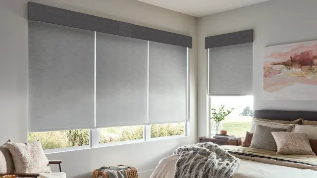
Mushroom sits between beige and light taupe. It’s a 2026 favorite because it hides dust better than pure white and pairs with both warm and cool décor.
Best rooms for mushroom tones:
- Living rooms with mixed woods
- Bedrooms with warm LEDs (2700K–3000K)
- Open-concept spaces where one shade color must work in multiple zones
CTA: If you’re trying to make one neutral work everywhere, use the World Wide Shades Shade Builder to preview a mushroom shade with your mount type and valance.
Cross-links for deeper planning:
- Color selection fundamentals: /blog/window-shades-color-guide
- What’s trending overall this year: /blog/window-shade-trends-2026
- Room-by-room approach for living spaces: /blog/best-roller-shades-living-room
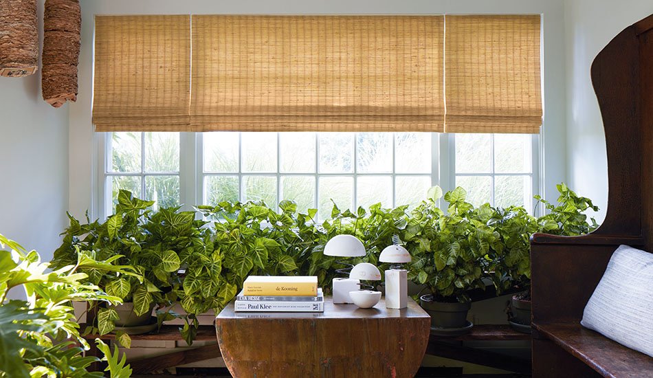
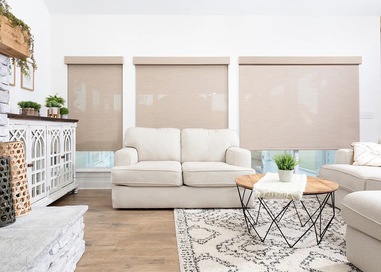
“Oat” is a creamy beige that feels clean, not yellow. It’s the safest choice if you want warmth without going full tan.
Where oat looks best:
- Homes with white oak flooring
- Modern farmhouse or transitional interiors
- Kitchens with warm white cabinets
Oat tones also pair naturally with textured fabrics.
Related read: /blog/natural-linen-look-roller-shades
Bright white shades can look harsh against warmer paint and can visually exaggerate light gaps along the sides.
In 2026, soft whites are the go-to:
- Creamy white for warmer paint palettes
- Warm white for balanced “neutral” rooms
- Off-white for spaces with stone and beige tile
Soft whites are especially strong in bedrooms, where the goal is calm.
Related read: /blog/best-window-shades-bedroom
CTA: Not sure which white is “right”? Order two to four swatches from World Wide Shades and compare them next to your trim at sunrise and at night.
Terracotta is showing up in 2026 as a muted, dusty version of orange—more “clay pot” than “pumpkin.” It’s often used as a single accent room color.
Best use cases:
- Dining rooms and breakfast nooks
- Southwest and Mediterranean-inspired homes
- Rooms with black hardware and warm wood
If you want earth tone warmth without committing to a bold wall color, roller shades are a controlled way to add it.
Greens are still popular, but in 2026 they’re softer, dustier, and more neutral.
Muted olive or sage shades work well when you already have:
- Natural stone counters
- Plants and organic textures
- Brass and bronze finishes
Related read: /blog/energy-efficient-window-shades (great pairing if you’re choosing solar-control fabrics).
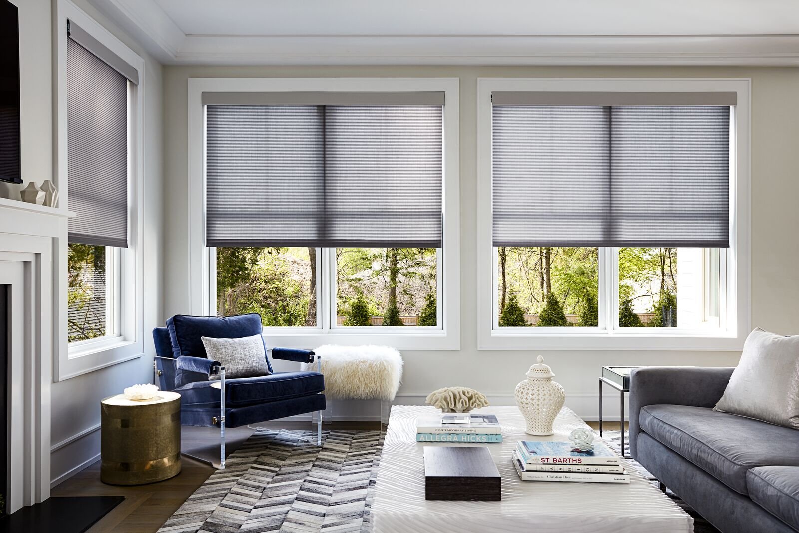
Cool grays can read blue in north light and feel “corporate.” Warm gray—often called greige—keeps the versatility of gray without the cold vibe.
If you have:
- Concrete floors
- Black window frames
- Minimalist décor
…warm gray shades keep the look modern without being sterile.
Matching 2026 shade colors to common wall paint families
You don’t need the exact paint brand to make a strong match. Use the family and undertone.
Choose:
- Soft white shades to avoid “two competing whites”
- Mushroom/putty for a subtle contrast
Avoid:
- Yellow-leaning beiges that can look dingy against crisp paint
Choose:
- Oat, warm white, cream, putty
- Terracotta accents if the room has warm wood
Choose:
- Greige shades that share the same undertone
- Mushroom neutrals
- Soft sage for an organic contrast
Choose:
- A shade that is one step lighter than the wall to keep the window clean
- Or one step darker if you want the window to be a design feature
CTA: The fastest way to confirm the “one step lighter” rule is to order swatches: World Wide Shades Swatches.
Texture is part of the color trend (and it changes the look)
In roller shades, texture affects how light reads across the fabric.
In general:
- Smooth fabrics look cleaner and more modern.
- Linen-look textures add warmth and hide small smudges.
- Woven/visual texture can make a light color look deeper.
If you love warm neutrals but worry they’ll look flat, a textured fabric in oat or mushroom is the 2026 “designer” move.
Related read: /blog/patterned-textured-roller-shades
Light control still matters: color trend + performance trend
Color trends are only half the decision. The “right” color is the one that also hits your light-control goal.
Light-filtering fabrics in soft white, oat, or putty create a warm glow instead of the cool, bluish light you get with bright white.
Related read: /blog/light-filtering-shades-guide
Blackout and room-darkening fabrics in mushroom or warm gray are practical in bedrooms because they hide everyday dust and fingerprints better than pure white.
Related reads:
- Bedroom blackout decision guide: /blog/roller-shades-bedroom-blackout-checklist
- Understanding gaps and how to reduce them: /blog/roller-shade-light-gaps-side-fix
CTA: If you want a “warm neutral blackout,” configure it directly in the World Wide Shades Builder and select blackout lining or fabric options.
Practical buying rules (numbers you can use)
These quick rules keep your selection looking intentional.
If your trim is a warm white, match a warm white shade or go one step deeper (oat/putty). If trim is bright white, use soft white or mushroom for gentle contrast.
Warm LEDs at 2700K make creams look richer. Neutral LEDs around 3000K–3500K make greiges look balanced. Cool LEDs at 4000K+ can wash out warm neutrals.
In open-concept layouts, one consistent neutral shade color across all street-facing windows typically looks more high-end than mixing colors room by room.
CTA: Need help choosing your “anchor neutral”? Call World Wide Shades at (844) 674-2716 or reach us via /contact.
How to use warm neutrals without making the room look yellow
Warm neutrals shouldn’t look “yellow.” If they do, it’s usually a mismatch between shade undertone and wall undertone.
Try these fixes:
- If your walls are neutral but your shade looks yellow: switch to mushroom/putty (less golden).
- If your walls are warm and your shade looks gray: switch to oat/cream (more warmth).
- If your room has lots of natural light: you can go one step deeper (putty instead of cream) and it still won’t feel heavy.
CTA: The low-risk way to avoid an undertone mistake is to start with swatches from World Wide Shades.
Recommended 2026 “starter set” of swatches (simple, high-signal)
If you want to pick quickly, order a small, strategic set rather than dozens.
A strong 2026 starter set:
- 1 soft white
- 1 warm white/cream
- 1 oat
- 1 mushroom/putty
- 1 muted earth tone (clay or sage)
Compare them:
- Morning (cooler daylight)
- Afternoon (brighter and warmer)
- Night with lamps (most yellow shift)
CTA: Get your starter set from World Wide Shades swatches, then finalize your exact build in the Builder.
FAQ: 2026 roller shade colors
Warm neutrals—especially mushroom/putty and oat tones—are the safest “designer neutral” choices in 2026 because they pair with mixed woods and warmer lighting.
Most homes look best when roller shades relate to the trim (usually 1 step warmer or 1 step deeper), while still coordinating with wall undertone.
Cool gray is fading, but warm gray (greige) remains popular because it works with black window frames, modern interiors, and stone finishes.
Yes. Texture creates highlights and shadows across the weave, which can make a shade appear 5–15% deeper depending on lighting and viewing angle.
For most rooms, 4–6 swatches is enough if you choose them strategically (two whites, two warm neutrals, and one to two earth tones).
Yes. You can start in the World Wide Shades Builder, order swatches, and contact our team at (844) 674-2716 or /contact for guidance.
Next steps: pick your 2026 color with confidence
2026’s best roller shade colors aren’t loud—they’re warmer, softer, and easier to live with.
CTA: Start your configuration in the World Wide Shades Shade Builder, order a small set of swatches, and if you want a second opinion, call (844) 674-2716 or message us at /contact.