Why a swatch test beats a screen image
A shade fabric can look beige on a monitor, gray in a showroom, and green beside your own flooring. Digital color is affected by display settings, while a small product photo cannot show how a weave changes the view at sunrise or how a blackout coating behaves against glass. A shade fabric swatch lighting test puts the material in the room where it has to work.
World Wide Shades recommends testing color and performance together. Order real fabric swatches before approving a whole home, especially when the project includes several exposures or a large picture window.
For a first pass on materials, compare best fabrics for roller shades and window shade fabric openness factor. How to order samples and swatches explains how to organize a larger sample set.
Build a useful swatch kit
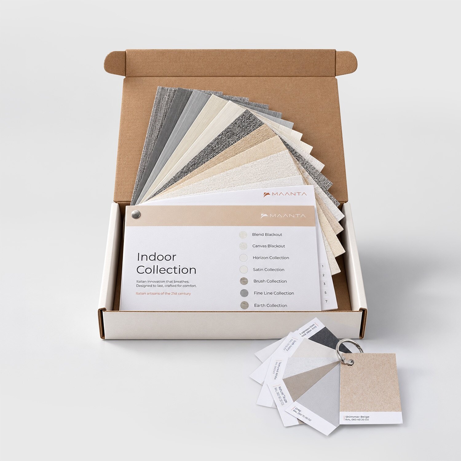
Request at least three candidate colors and two performance levels. For example, compare a warm white, a neutral gray, and a natural sand in 3% and 5% openness. A small 4-by-6-inch card is helpful for color, but a larger sample or a mounted piece gives a more honest sense of texture, transparency, and backing.
If the room faces strong sun, include a light and a dark version of the same weave. If the room needs darkness, include a true blackout sample and a room-darkening sample so you can see the difference at the edges. World Wide Shades can narrow a broad collection to a practical set rather than sending dozens of nearly identical neutrals.
Write the collection, color, openness, and date on the back. Photograph each sample next to the window, flooring, paint, and trim. Keep the samples in the room for at least 24 hours because daylight shifts from cool morning light to warmer evening light, and your artificial lighting may reveal a different undertone.
Use painter's tape or removable clips instead of permanent adhesive. Do not tape a sample directly to a finished wall if the paint is fragile. Ask World Wide Shades for a sample-testing plan if you are comparing fabrics across multiple rooms.
Test at four times of day
At 8:00 a.m., place the swatch flat against the glass and then about 6 inches inside the room. Record whether the weave looks blue, yellow, pink, or neutral and whether the exterior view remains legible. East-facing windows reveal the strongest morning contrast.
At noon, check direct light, reflected light from a patio or adjacent wall, and the amount of illumination on work surfaces. Hold the swatch at the intended shade position rather than on a tabletop. A 5% screen may look almost open on a cloudy day but much more controlling in direct sun.
Between 4:00 and 6:00 p.m., test west-facing windows when glare is usually hardest. Look at the television, monitor, artwork, and floor. Take a phone photo from the main seating position; the camera will not perfectly reproduce the eye, but it can reveal a hot spot or obvious color shift.
Turn on the room lights and stand outside if possible. A solar screen that offers daytime privacy can show silhouettes when the interior is brighter than the exterior. If nighttime privacy matters, compare the swatch with the room-darkening or blackout option. Our UV protection window shades guide covers sun exposure, while light-filtering shades explains why diffusion and privacy are different performance goals.
Evaluate the five attributes that matter
Look at the sample beside the largest fixed element in the room, such as the floor, countertop, sofa, or cabinetry. Do not match the shade only to a paint chip. A warm-white shade beside cool-white trim can look yellow; a blue-gray shade beside warm oak can look more blue than expected.
Check the fabric from at least 10 feet away and from the room entrance. Roller shades cover a large visual rectangle, so a color that feels refined as a small card can become dominant across a 72-inch-wide window. The window shades color guide can help you choose between blending, contrasting, and repeating an accent.
Openness factor describes the approximate percentage of the fabric area that is open. A 1% screen has a tighter weave than a 5% or 10% screen, but the view also depends on interior versus exterior brightness, color, and glass. Look through the sample at a tree line or building edge rather than a blank sky.
Write down what you can see at 3 feet and 15 feet. If privacy is more important than view, test after dark. World Wide Shades can explain why a particular openness is a starting point, not a guarantee for every orientation.
Hold the swatch over a white page, a dark page, and a phone screen. Observe how much contrast remains. In an office or den, the goal is often to reduce the bright window-to-screen contrast rather than make the whole room dim. The advice in noise-reducing window shades is useful when the same room also faces a loud street.
A subtle basket weave or linen look can add warmth, but heavy texture may look busy when repeated across many windows. A smooth blackout may feel more contemporary and can be easier to clean. Put two samples side by side and walk past them; the difference is easier to notice in motion than when you study one card at a time.
Look at the outside-facing side as well as the room side. In a neighborhood with close views, a coordinated exterior color may matter. An HOA or historic district may have rules about visible shades. Contact World Wide Shades for help comparing an exterior-facing finish with the interior palette.
Use a simple scoring sheet
Give each candidate a score from 1 to 5 for color, glare control, privacy, view, texture, and cleaning. Add a note for the worst hour and the room's main activity. A sample that scores 5 for color but 2 for glare may be right for a north-facing dining room and wrong for a west-facing television wall.
Example:
- Warm white, 5% screen: color 5, view 5, glare 2, privacy 2.
- Gray, 3% screen: color 4, view 3, glare 4, privacy 3.
- Room-darkening roller: color 4, view 1, glare 5, privacy 5.
The numbers are not laboratory ratings; they are a way to make the household's priorities visible. World Wide Shades can translate those observations into a fabric and mount recommendation. Share your score sheet with World Wide Shades when you want a second opinion.
Test the mount, not only the fabric
A sample cannot show every installation detail, so make a quick mock-up. Measure the proposed inside-mount width, mark the outside-mount overlap with painter's tape, and check whether the shade would cover handles, trim, or a backsplash. If you are considering a fascia or cassette, use cardboard to mark the approximate depth.
For blackout applications, tape the swatch to the glass and shine a flashlight from behind it. Then add temporary strips at the side edges to mimic overlap. This shows whether the main concern is fabric transmission or perimeter light. Read blackout curtains versus blackout shades before choosing a solution for a bedroom or theater.
If the project includes unusually shaped windows, compare skylight shades guide and roller shades for French doors. World Wide Shades can review the mounting conditions, not just the color card. Request a project review before you place a large multi-room order.
Avoid common swatch mistakes
An LED bulb at 3000K can make a neutral gray look warmer; a 4000K bulb can make it look cooler. Test with the room's actual lamps and overhead fixtures, then repeat with daylight.
Edges, hems, seams, and a blackout backing can change the finished impression. Ask how the fabric will be seamed on a wide shade and whether a fascia or cassette will be visible.
A white table removes context. Place the sample beside the materials that will remain in the room and view it from the sofa, desk, and doorway.
Daytime privacy is not nighttime privacy. Stand outside after dark or ask a helper to photograph the window while the room lights are on.
FAQ: testing shade fabric swatches
Keep it for at least one full day and, ideally, 24 to 48 hours. That gives you morning, midday, late-afternoon, and evening conditions and helps reveal a color shift you would miss in a showroom.
Start with three colors and two performance levels, or about six samples for a significant room. Narrow the choices before ordering larger samples or finalizing a whole-house palette.
Generally, yes. A 1% screen has a tighter weave than a 3%, 5%, or 10% screen, but perceived glare also depends on fabric color, glazing, direction, and interior brightness. Compare the samples in the actual window.
It can show fabric transmission, but it cannot predict side gaps and bottom-edge light. Mock up the mount and overlap, or ask World Wide Shades to recommend a coverage plan for the opening.
Usually compare it to the largest permanent surfaces, including flooring, cabinetry, upholstery, and trim. A shade should look intentional from the room entrance, not only match a small paint card.
Photograph the finalists, record your scores, and note the worst glare or privacy condition. Send the results to World Wide Shades, explore more swatches, or call (844) 674-2716 for a measured recommendation.
Let the room make the decision
The best fabric is the one that performs through changing daylight and still belongs with the room's materials. A disciplined swatch test takes minutes at each time of day and can prevent an expensive mismatch across a large window wall. World Wide Shades can help you interpret the results, confirm the mount, and coordinate fabrics across rooms. Start with World Wide Shades swatches and request your final plan.